Sunday Stories: The Journey of Green Oasis — A Brand Identity by Akshita
Sunday Stories: The Journey of Green Oasis — A Brand Identity by Akshita
By Akshita Agarwal, Posted on July 27th 2024
By Akshita Agarwal, Posted on July 27th 2024
Welcome to the inaugural edition of Sunday Stories, where we celebrate the extraordinary talent of designers who transform ideas into visual masterpieces every Sunday. Today, we are delighted to introduce Akshita Agarwal, a gifted visual communication designer who has recently crafted an enchanting brand identity for Green Oasis, a unique farm-to-table restaurant.

Foreword
Design isn’t just about aesthetics; it’s about weaving a story that resonates deeply with its audience. Akshita epitomizes this philosophy. With over four years of experience in brand identity and packaging design, she has mastered the art of creating brands that not only catch the eye but also touch the heart. Her recent project, Green Oasis, is a perfect example of how thoughtful design can bring a brand’s essence to life.

A Designer’s Tale: Akshita’s Journey to Green Oasis
Imagine stepping into a place where the hustle of urban life meets the tranquility of nature. This is the vision Akshita had when she embarked on designing the brand identity for Green Oasis. She envisioned a space that not only offers fresh, farm-to-table cuisine but also provides an elegant escape from the everyday grind.
“As a visual communication designer, I specialize in creating brands that resonate with audiences and leave a lasting impression,” Akshita begins. “With over four years of experience in brand identity and packaging design, I’ve had the privilege of working with diverse industries. My journey has been all about delivering fast, high-quality solutions that drive market success and impact. I’m on a mission to take design beyond the screen, transforming brands into memorable experiences.”

Discovering the Essence
Designing a brand is more than just making it look good. It’s about understanding the soul of the business — its values, its goals, and its story. For Green Oasis, Akshita began her design process with deep research. She immersed herself in the world of farm-to-table dining, studied competitors, and most importantly, listened to the vision of Green Oasis.
“My design process starts with deep research. I dive into the industry, study competitors, and listen to the client’s vision. This helps me create a brand identity that is not only visually appealing but also meaningful and strategic,” she explains.
Crafting Simplicity and Elegance
In a world full of fleeting trends, Akshita believes in the timeless power of simplicity and elegance. Every element of her design is chosen with intention, contributing to a cohesive and compelling brand story.
“I believe in simplicity and elegance. My designs aim to be timeless, avoiding fleeting trends. I focus on creating a unique visual language that speaks to the target audience and stands out in the market. Every color, shape, and line is chosen with intention, ensuring it contributes to the overall story of the brand.”

The Green Oasis Vision
For Green Oasis, a farm-to-table restaurant, the challenge was to create a brand that reflects its commitment to sustainability and exceptional dining experiences. Akshita’s passion for both design and sustainability made this project particularly exciting.
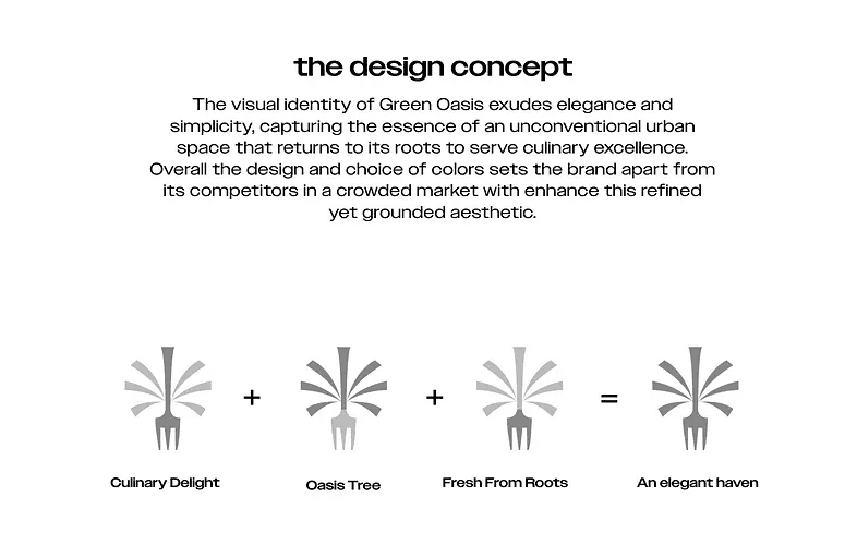
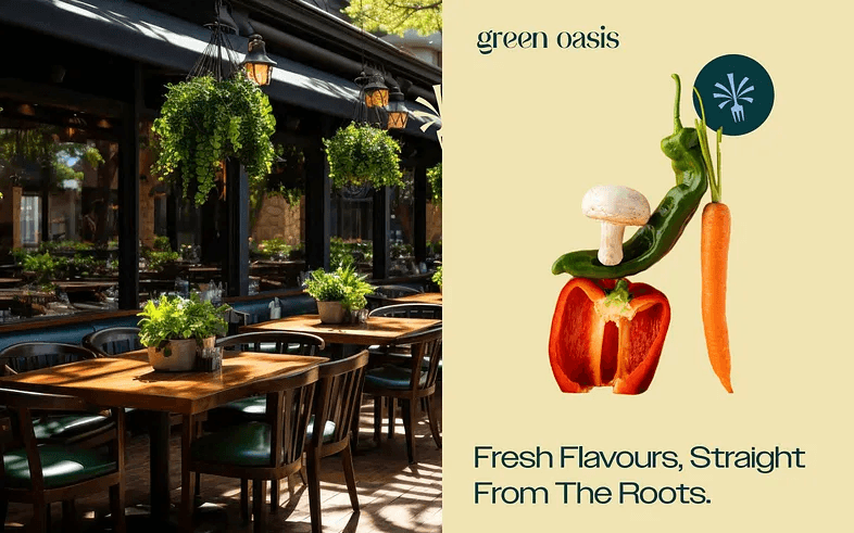
“Green Oasis is more than a restaurant; it’s an experience. It’s a place where urban living meets nature, offering a fresh and elegant culinary haven,” Akshita shares. “The visual identity for Green Oasis needed to capture this unique essence. I wanted to create a brand that exudes elegance and simplicity, reflecting the restaurant’s commitment to returning to its roots and serving culinary excellence.”

The Heart of the Brand: Colors and Logos
Choosing the right colors was crucial. Akshita selected a palette that would set Green Oasis apart in a crowded market, while still staying true to its values.
“The choice of colors was crucial. I opted for a palette that sets Green Oasis apart from competitors in the crowded market. The refined and grounded aesthetic not only represents the restaurant’s values but also appeals to its target audience.”

One of the standout features of the Green Oasis branding is the logomark — a beautiful fusion of an oasis tree and a fork. This symbol not only captures the essence of the restaurant but also tells its story.
“One of the standout elements of the branding is the logomark. It’s a combination of an oasis tree and a fork, symbolizing an elegant culinary haven. This logo is more than just a visual mark; it tells the story of Green Oasis. It speaks to the restaurant’s mission of serving freshness and creating a space for people to make memories with themselves, their families, and their communities.”
Beyond the Conventional
Akshita’s vision for Green Oasis was to create something refreshing and unexpected in the hospitality space. She aimed to break away from conventional designs and craft a brand identity that is both eye-catching and meaningful.
“My vision for Green Oasis was to design something refreshing and unexpected for the hospitality space. I wanted to break away from the conventional and create a design language that is both eye-catching and meaningful. The result is a brand that is not only visually appealing but also deeply connected to its roots.”
A Rewarding Experience
Working on Green Oasis was more than just a project for Akshita; it was a rewarding journey that reaffirmed her belief in the transformative power of design.
“Working on this project was a rewarding experience. It challenged me to think creatively and strategically, and I’m proud of the outcome. Green Oasis is now not just a restaurant but a brand that stands out and resonates with its audience. This project reaffirmed my belief in the power of design to transform businesses and create memorable experiences.”
Conclusion
Akshita’s work on Green Oasis is a shining example of how thoughtful, strategic design can elevate a brand. Her ability to blend aesthetic appeal with meaningful storytelling has resulted in a brand identity that truly stands out. As we celebrate the launch of Sunday Stories, we are excited to feature more inspiring projects and the talented designers behind them.
Stay tuned for more amazing designs and stories every Sunday, and don’t forget to follow us on Instagram for the latest updates from the world of design.
Connect With Akshita
All Social Links: https://dotme.bio/akshita
Wanna Get Featured?
Write us about yourself and your project on this email : designare.hq@gmail.com
We will reply within 24hours and give you an update!
Welcome to the inaugural edition of Sunday Stories, where we celebrate the extraordinary talent of designers who transform ideas into visual masterpieces every Sunday. Today, we are delighted to introduce Akshita Agarwal, a gifted visual communication designer who has recently crafted an enchanting brand identity for Green Oasis, a unique farm-to-table restaurant.
Foreword
Design isn’t just about aesthetics; it’s about weaving a story that resonates deeply with its audience. Akshita epitomizes this philosophy. With over four years of experience in brand identity and packaging design, she has mastered the art of creating brands that not only catch the eye but also touch the heart. Her recent project, Green Oasis, is a perfect example of how thoughtful design can bring a brand’s essence to life.
A Designer’s Tale: Akshita’s Journey to Green Oasis
Imagine stepping into a place where the hustle of urban life meets the tranquility of nature. This is the vision Akshita had when she embarked on designing the brand identity for Green Oasis. She envisioned a space that not only offers fresh, farm-to-table cuisine but also provides an elegant escape from the everyday grind.
“As a visual communication designer, I specialize in creating brands that resonate with audiences and leave a lasting impression,” Akshita begins. “With over four years of experience in brand identity and packaging design, I’ve had the privilege of working with diverse industries. My journey has been all about delivering fast, high-quality solutions that drive market success and impact. I’m on a mission to take design beyond the screen, transforming brands into memorable experiences.”
Discovering the Essence
Designing a brand is more than just making it look good. It’s about understanding the soul of the business — its values, its goals, and its story. For Green Oasis, Akshita began her design process with deep research. She immersed herself in the world of farm-to-table dining, studied competitors, and most importantly, listened to the vision of Green Oasis.
“My design process starts with deep research. I dive into the industry, study competitors, and listen to the client’s vision. This helps me create a brand identity that is not only visually appealing but also meaningful and strategic,” she explains.
Crafting Simplicity and Elegance
In a world full of fleeting trends, Akshita believes in the timeless power of simplicity and elegance. Every element of her design is chosen with intention, contributing to a cohesive and compelling brand story.
“I believe in simplicity and elegance. My designs aim to be timeless, avoiding fleeting trends. I focus on creating a unique visual language that speaks to the target audience and stands out in the market. Every color, shape, and line is chosen with intention, ensuring it contributes to the overall story of the brand.”
The Green Oasis Vision
For Green Oasis, a farm-to-table restaurant, the challenge was to create a brand that reflects its commitment to sustainability and exceptional dining experiences. Akshita’s passion for both design and sustainability made this project particularly exciting.
“Green Oasis is more than a restaurant; it’s an experience. It’s a place where urban living meets nature, offering a fresh and elegant culinary haven,” Akshita shares. “The visual identity for Green Oasis needed to capture this unique essence. I wanted to create a brand that exudes elegance and simplicity, reflecting the restaurant’s commitment to returning to its roots and serving culinary excellence.”
The Heart of the Brand: Colors and Logos
Choosing the right colors was crucial. Akshita selected a palette that would set Green Oasis apart in a crowded market, while still staying true to its values.
“The choice of colors was crucial. I opted for a palette that sets Green Oasis apart from competitors in the crowded market. The refined and grounded aesthetic not only represents the restaurant’s values but also appeals to its target audience.”
One of the standout features of the Green Oasis branding is the logomark — a beautiful fusion of an oasis tree and a fork. This symbol not only captures the essence of the restaurant but also tells its story.
“One of the standout elements of the branding is the logomark. It’s a combination of an oasis tree and a fork, symbolizing an elegant culinary haven. This logo is more than just a visual mark; it tells the story of Green Oasis. It speaks to the restaurant’s mission of serving freshness and creating a space for people to make memories with themselves, their families, and their communities.”
Beyond the Conventional
Akshita’s vision for Green Oasis was to create something refreshing and unexpected in the hospitality space. She aimed to break away from conventional designs and craft a brand identity that is both eye-catching and meaningful.
“My vision for Green Oasis was to design something refreshing and unexpected for the hospitality space. I wanted to break away from the conventional and create a design language that is both eye-catching and meaningful. The result is a brand that is not only visually appealing but also deeply connected to its roots.”
A Rewarding Experience
Working on Green Oasis was more than just a project for Akshita; it was a rewarding journey that reaffirmed her belief in the transformative power of design.
“Working on this project was a rewarding experience. It challenged me to think creatively and strategically, and I’m proud of the outcome. Green Oasis is now not just a restaurant but a brand that stands out and resonates with its audience. This project reaffirmed my belief in the power of design to transform businesses and create memorable experiences.”
Conclusion
Akshita’s work on Green Oasis is a shining example of how thoughtful, strategic design can elevate a brand. Her ability to blend aesthetic appeal with meaningful storytelling has resulted in a brand identity that truly stands out. As we celebrate the launch of Sunday Stories, we are excited to feature more inspiring projects and the talented designers behind them.
Stay tuned for more amazing designs and stories every Sunday, and don’t forget to follow us on Instagram for the latest updates from the world of design.
Connect With Akshita
All Social Links: https://dotme.bio/akshita
Wanna Get Featured?
Write us about yourself and your project on this email : designare.hq@gmail.com
We will reply within 24hours and give you an update!